A file that is “nearly right” costs more than a file that is wrong. Wrong gets rejected at the counter; nearly right gets printed — and the white line along one edge, or the logo that came out muddy, is only discovered when a thousand copies are sitting in a box. This is the sequence we follow before anything goes to press, written so you can follow it with whatever software you already have.
Quick Answer
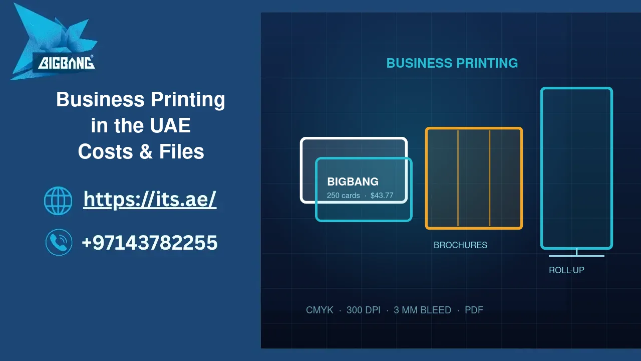
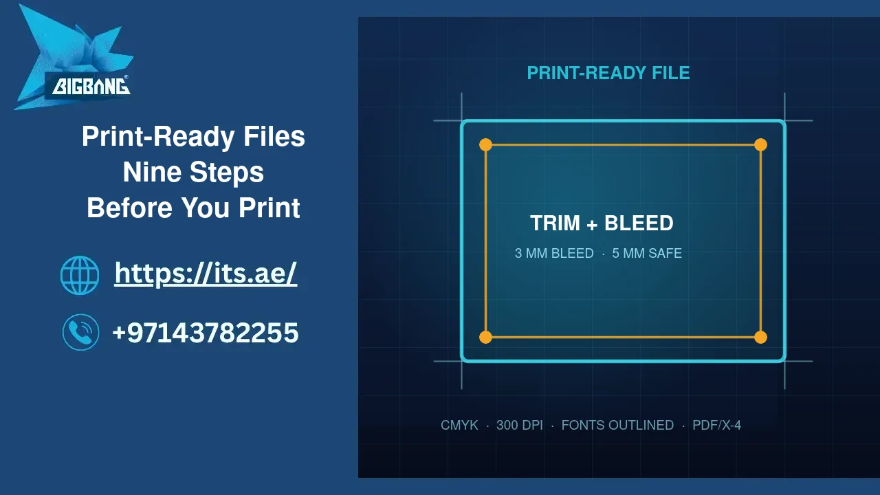
Set the document at final size with 3 mm bleed and a 5 mm safe margin. Work in CMYK. Place images at 300 dpi at the size they appear. Outline or embed fonts. Export PDF/X-4 with crop marks and bleed included. Then run six checks on the exported PDF, not on the design file. Nine steps in total, and they take less time than one reprint.
Step 1 — Start the document at final size
Create the page at the trim size you want: 90 × 50 mm for a card, A5 for a flyer, 85 × 200 cm for a roll-up. Do not design A4 and scale later — text weights and margins shift when you scale, and hairlines disappear.
Step 2 — Add bleed and a safe margin
Bleed is background that extends 3 mm beyond every edge. Cutting machines are accurate to a fraction of a millimetre, but paper stacks move. Without bleed, a shift of half a millimetre leaves a white sliver. Then keep all text and logos at least 5 mm inside the trim so nothing sits at risk.
For large format the numbers change: a roll-up needs the artwork extended at the top and bottom for the rails, and the bottom 15–20 cm should carry no essential text because a table or a visitor hides it.
Step 3 — Work in CMYK, not RGB
Screens emit light and print absorbs it. A saturated screen blue or neon green has no ink equivalent, so the press produces the nearest printable colour and the result looks flat next to what you approved. Set the document to CMYK from the start, and convert images rather than letting the printer guess.
If your brand has a specific colour, define it once — a Pantone reference or a fixed CMYK breakdown — and reuse that value everywhere. A logo that is 100 % cyan in one file and 95 % in another will visibly differ across two pieces on the same table.
Step 4 — Use images at the right resolution
Effective resolution is what matters: an image of 1000 × 1000 pixels placed at 4 cm is sharp, and the same image stretched to 20 cm is not. Aim for 300 dpi at the final size. For very large formats you can drop to 150 dpi, because the viewing distance is longer.
Never take a logo from a website. Ask for the vector file — AI, EPS, SVG or a PDF that contains vectors. A vector logo prints crisp at any size.
Step 5 — Handle fonts properly
Either outline the text or embed the fonts in the export. Missing fonts are the single most damaging failure in Arabic artwork: letters that should join break apart, diacritics land in the wrong place, and lines re-break. Outlining removes the risk entirely, at the cost of no longer being able to edit the text — so keep an editable master file as well.
Step 6 — Check the black
Small text should be 100 % black only (K), not a mix of all four inks. Four-colour black on 9 pt text produces fuzzy edges if the sheets shift slightly. Large solid areas are the opposite case: a “rich black” mix looks deeper than flat K on a big panel. As a starting point, use K-only for text and a rich mix for large blocks.
Step 7 — Export the right PDF
Export as PDF/X-4 (or PDF/X-1a if your printer asks for it). In the export dialogue: include bleed, add crop marks, do not downsample images, and embed the colour profile. The resulting file is a print contract — what it contains is what will be printed.
Step 8 — Six checks on the exported PDF
| Check | How | What tells you it is wrong |
|---|---|---|
| Page size | Document properties | Size differs from the trim you ordered |
| Bleed | Look at the crop marks | Background stops exactly at the mark |
| Colour | Output preview | An RGB or spot colour you did not intend |
| Images | Zoom to 400 % | Soft or blocky edges |
| Fonts | Fonts tab in document properties | A font listed as not embedded |
| Text | Read every number aloud | A phone digit or an email typo |
Step 9 — Approve the proof, not the screen
Ask for a digital proof and open it at 100 %. If colour matters — a brand red, a product photograph — ask for a printed proof before the full run. It costs a little and settles the argument before a thousand copies exist.
Arabic artwork: four things that break quietly
- Justification: Arabic stretches with kashida, not by spacing letters apart. Letter-spacing an Arabic line breaks the joins.
- Line height: Arabic needs a little more leading than Latin at the same size, or ascenders and dots collide.
- Numerals: pick Arabic-Indic or Latin digits and use one style throughout the piece.
- Mixed lines: a Latin word inside an Arabic sentence can reorder on export. Check the exported PDF, not the design canvas.
Frequently asked questions
What if I only have a JPG of my design?
It can be printed if the resolution is high enough at final size, but it cannot be edited and it will not have bleed. For anything that will be reprinted, it is worth rebuilding once as a proper file.
Do I need Adobe software?
No. Any tool that exports a PDF with bleed and embedded fonts works. What matters is the export settings, not the brand of the application.
Who fixes a file that arrives wrong?
We tell you before printing and either return it with the list of issues or fix it for you and send a proof for approval. Nothing goes to press on a guess.
Sources
- PDF Association — the PDF/X-4 standard
- Adobe — exporting PDFs for print (bleed, marks, profiles)
- ISO 216 — international paper sizes
Where We Are
BIGBANG ITS FZE prepares print-ready artwork and produces printing for companies across the UAE from Sharjah. Prices and ordering are in our store, the service page is here, and our guide on what to print and what it costs is here. Send us your files at contact us and we will check them before anything is printed.
Talk to us directly — we usually reply within minutes during business hours.